
The problem
Group trips break at the moment of choosing
Preferences arrive in a chat thread. A vote comes back even. Someone quietly decides, and the group finds out later.
Every planning tool is good at the parts either side of that moment — listing places, drawing a route — and vague about the moment itself. Wayfold's slice is built around it: the shortlist vote is designed to come back tied, and the screen that follows is the one that has to earn its place.
Scope was fixed before any pixel: six primary screens, three edge states, no all-state menu, no debug inspector, no marketing page. Everything the prototype shows is something a trip owner would actually meet.
The one trip the prototype ships
Solvara long weekend · Fri 8 – Sun 10 May 2026 · Renna Calder (owner) with Mara Ostell and Devan Roche · shortlist of Halra Point, Vessant Quarter and Ombrine Terraces · five stops from the ferry dock to the Cala Verde boardwalk at sunset.
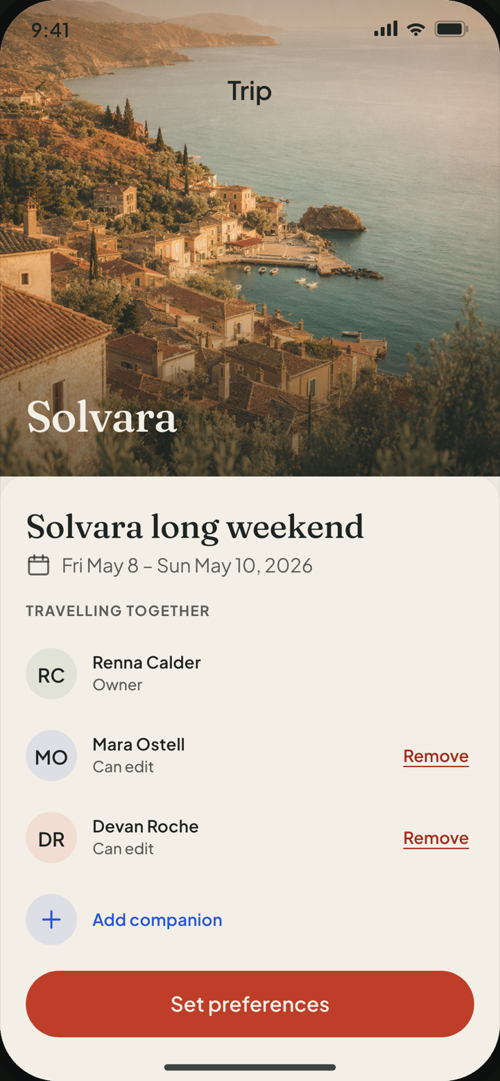
Every place, person and time here is invented. No real business, price, review or opening hour appears anywhere in the build — the fiction is the fixture, and it is identical in the spec, the stories and the tests.
The route
Six stops, and three places the route can leave the line
Each transition has exactly one trigger, decided in advance. Nothing in the flow advances on a timer or a guess, and every trigger below is a control the product actually exposes — which is why the same list drives the end-to-end tests.
-
Trip Brief
Trip has a name and dates, both companions appear in the roster → Set preferences
-
Preference Pass
Panels 1–4 each hold a committed choice, progress reads 4 / 4 → See destinations
-
Shortlist Vote
1st and 2nd picks staged in the rank rail → Submit picks · the result contains a first-place tie
-
Tie Resolution
Tie present, so the comparison sheet is entered rather than skipped; evidence read → Confirm Halra Point
-
Itinerary Map
Five stops ordered and the closed venue resolved → Confirm plan
-
Detour A — venue closed
Stop 4's hours do not cover the planned Sunday-afternoon slot, so the row carries an inline Closed for this slot state.
Returns via “Move to Sat 15:00” → stop marked resolved -
Detour B — offline map pack
Saved deliberately before travelling, and re-entered as a fallback when Live Day opens with no connectivity.
Returns via “Done” → map, or “Use offline” → Live Day -
Detour C — location permission denied
Live Day asks for precise location at entry; the modelled OS answer is denied, and a full-screen recovery panel takes over.
Returns via “Open Settings”, or “Continue without location” → degraded day
-
-
Live Day
End of the critical slice — the itinerary in use, offline, one stop at a time

The happy path is rigged to tie. If the vote came back clean the hardest screen would never be seen, so stop 4 is on the main line, not a branch — the clean-result route exists, but it lives in the test harness.
Design decision · 1
The tie is the product, so it is shown
A group vote lands even far more often than three people expect. The common answer is to break it invisibly — first submitted wins, or alphabetical, or a weighting nobody sees. That produces a decision without a reason, which is exactly what the group was trying to avoid.
Wayfold names the tie in the heading, then earns its way out of it. Three evidence rows — hours, travel, group lean — are open by default, with no disclosure toggle to hide behind. The group split is stated by name: two of three. The winner is proposed; the confirmation is still the user's tap.
“Two picks landed even. Wayfold lined up the facts.”
The ranking that produces the tie has the same rule applied to it. The drag-to-rank gesture is a custom pointer layer, but every rank it can stage is also reachable through named buttons — Move up, Previous, Next destination — so the ranking is not a gesture with an accessibility apology attached, it is two equal paths to the same state.
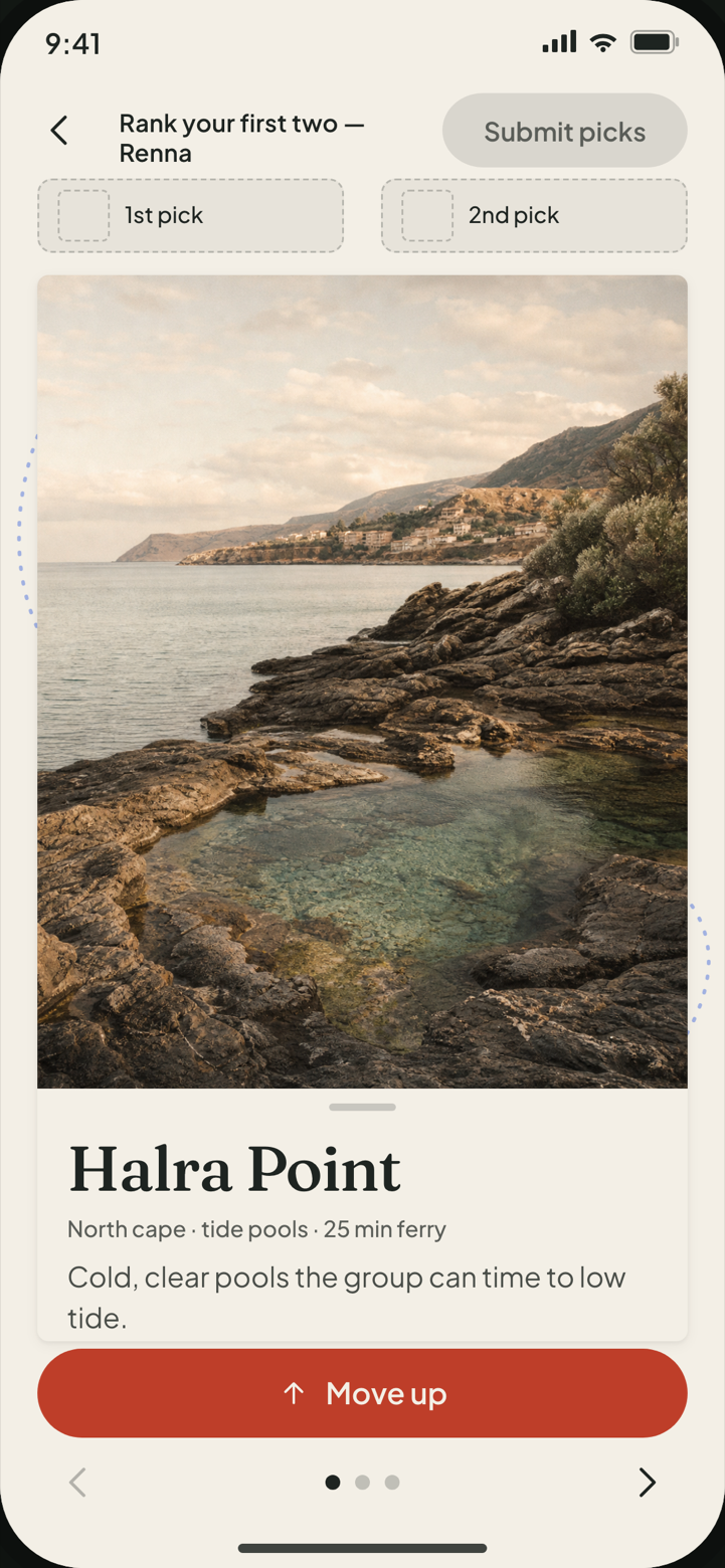
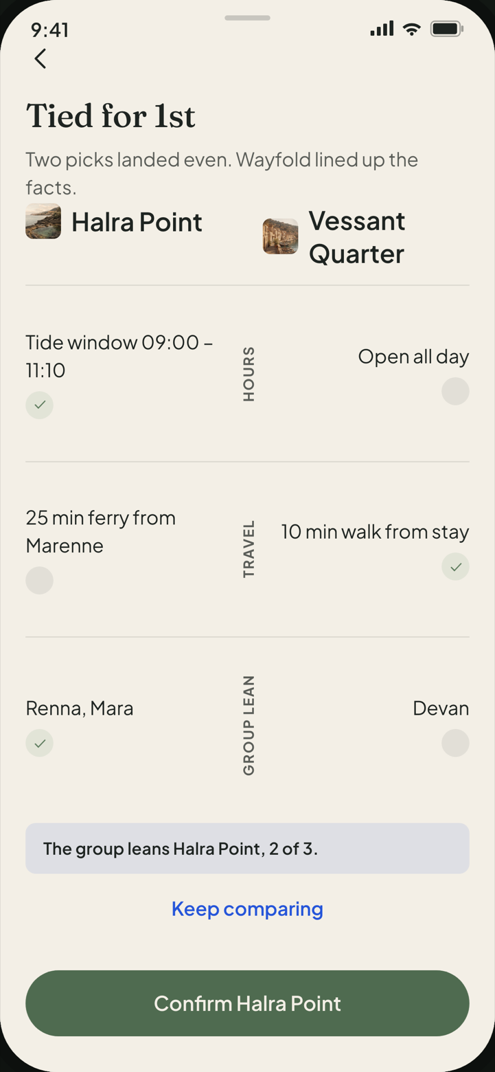
The evidence rows are open at rest on purpose. A collapsed row would let the screen claim transparency while still hiding the reason — disclosure you have to ask for is not disclosure.
“Confirm Halra Point” names the destination instead of saying Continue. A generic label would make the commit reversible-looking when it is not.
Design decision · 2
Four questions, asked one at a time
The preference pass could have been one scrolling form. It is four panels instead, each holding a single committed choice — pace, food, culture, budget — with progress reading Step 1 of 4 through Step 4 of 4, and Continue disabled until something is chosen.
Staging it buys two things a form cannot. Each answer arrives with a support line that says what it changes (“this sets the pace of the whole day plan”), which a stacked form flattens into noise. And a partially answered form is ambiguous — skipped, or still thinking? — whereas a panel that will not advance is unambiguous. Completed panels stay reachable: tapping a finished progress segment re-opens it.
Only the fourth panel reveals See destinations. The shortlist is never shown against half a set of preferences.
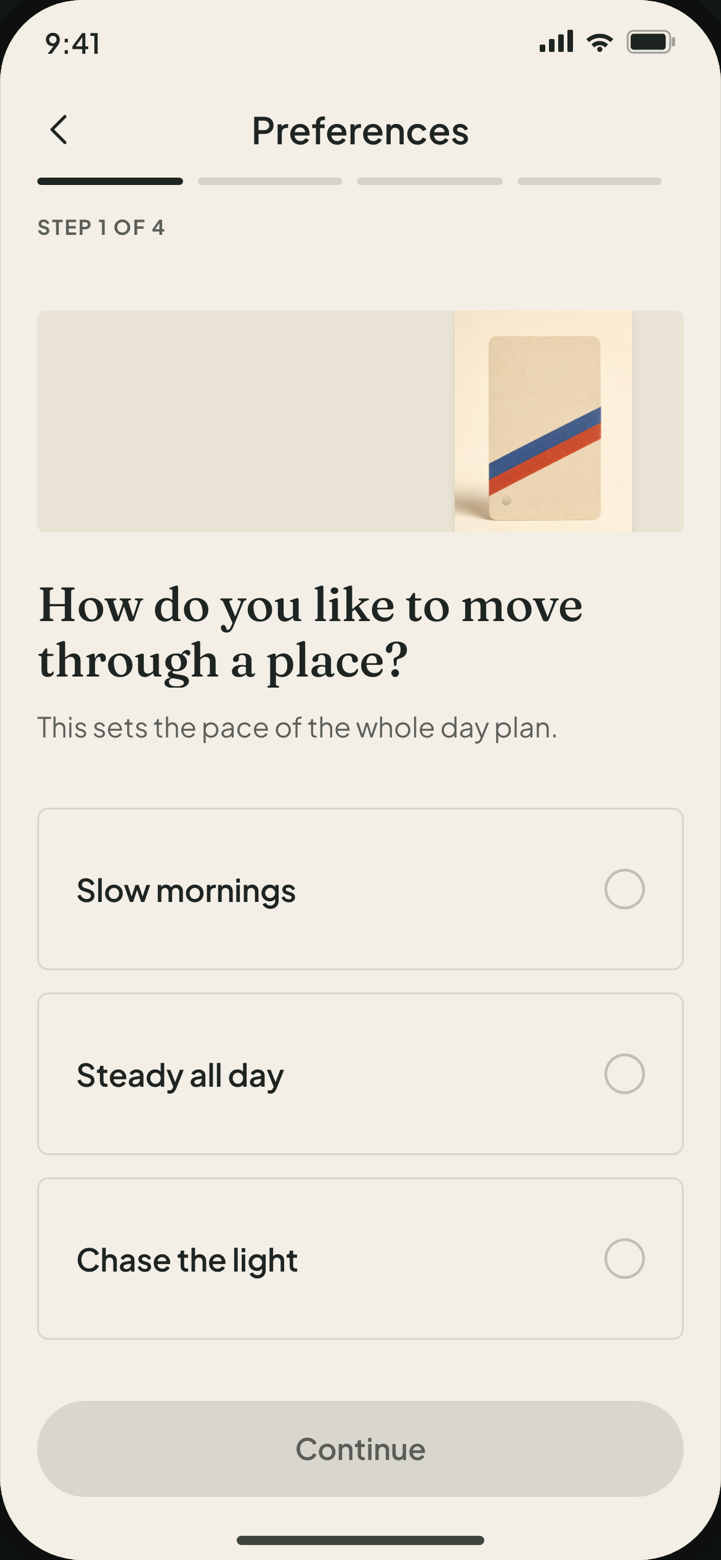
This screen failed its first visual review outright — three empty bordered rectangles and three hundred pixels of dead air. The single repair pass was spent here and on five collision defects, not on shadows or spacing nudges.
It then passed a second review it should not have. That review saw panel 1. Panel 2 was rendering its question over its own support line, and panels 3 and 4 opened on an empty tint band, because the head band ordered in the first repair had been verified on one of its four instances. One frame is not a review of a screen that has four states — the reason round 2 was withdrawn, in the colophon.
Design decision · 3
Coming back from no signal and no permission
The three edge states are not error screens bolted on at the end. They are part of the trip: a headland with no reception, a venue shut on the afternoon it was planned for, and an operating system that says no. Each one is treated as a state with a way out, and each way out is a control that already exists on the screen.
Offline is a status, not an alarm
The map pack is offered before it is needed — a control on the Itinerary Map, downloaded with visible progress, ending in a quiet Downloaded chip. The same state is re-entered as a fallback if Live Day opens with no connectivity, so the fallback is a path the user has already seen. Once offline, Live Day carries a small OFFLINE pill and nothing else changes: the time rail, the current stop and the next action all still work.
A refused permission still leaves a working plan
Live Day asks for precise location at entry. When the answer is denied, the recovery panel leads with what location is for — marking the current stop and timing the walk — then offers two real exits: Open Settings, which deep-links out and returns with a live position, and Continue without location, which enters a degraded day where the current stop is chosen by hand. The plan survives the refusal, which is the whole point of saying so in the copy.
A closed venue blocks the commit, not the user
Stop 4's hours do not cover its Sunday-afternoon slot. The row says so inline and offers the specific fix — Move to Sat 15:00 — and Confirm plan stays disabled until it is resolved. The gate is on the plan being coherent, not on the user having read a warning.
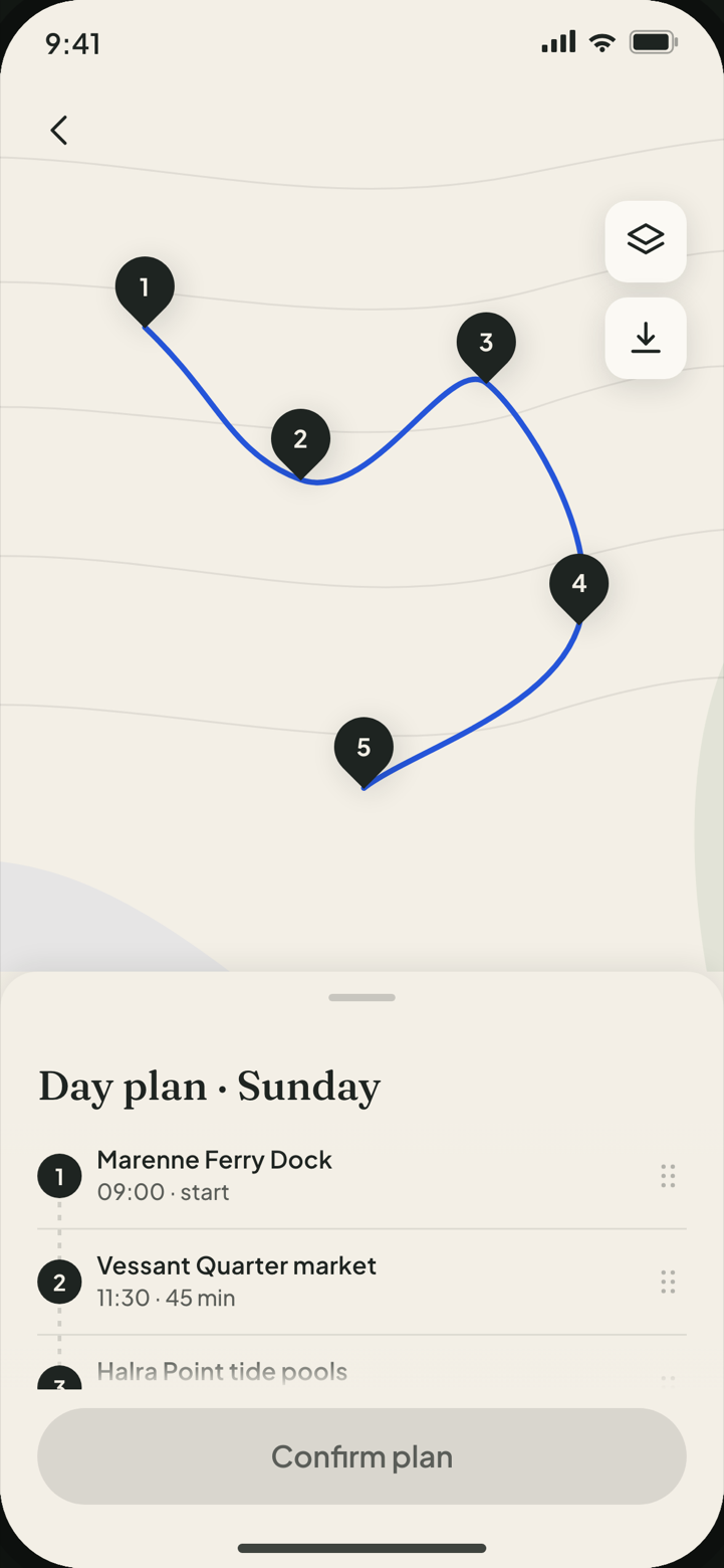
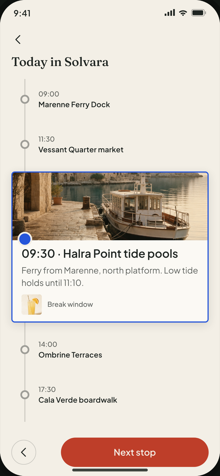
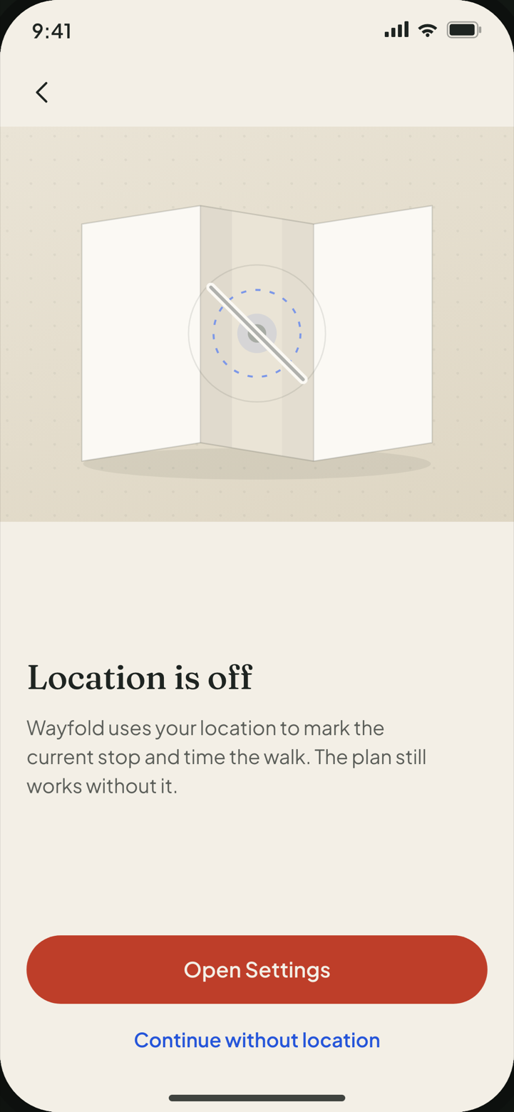
All three edge states are public, not QA fixtures. A person on the trip reaches every one of them by using the product, so they are held to the same finish as the happy path.
Nothing here uses a blocking banner. A banner tells you that you are stuck; a status plus a named action tells you what to do next.
The take
The whole slice, walked once, unbroken
Recorded straight from the running build. Every step in the take goes through a control the product exposes by role and accessible name — the same drivers the end-to-end suite uses — so the recording is the prototype behaving, not a storyboard being played back.
- Length
- 24.64 s
- Frame
- 390 × 844 · VP8 / WebM
- Captured by
- Playwright, against the real Vite build
- Covers
- Trip Brief → four preference panels → ranking → tie → itinerary and closed-venue fix → location denied → offline pack → Live Day
The take has no cuts and no speed-ups. Pauses were added between taps so the screens can be read — the only thing directed here is the pace.
Coverage
What a user can reach, and what only the harness can
Every state in this project is filed on one of two surfaces before it is built. Public states are the ones a trip owner reaches by using the product. QA-only states — skeletons, validation resets, a three-way tie, the empty map, the clean-vote branch that skips the tie — live in Storybook and the test suite and never appear in the shipped bundle.
That split is why the prototype has no states menu, no help overlay, no
debug panel, no inspector, no flow-step list and no reduced-motion
toggle. Reduced motion is honoured through the
prefers-reduced-motion media query alone, because the trip
slice has no genuine product need for a switch. A test asserts all of
that at runtime on every rendered surface, not just in the source.
| Screen | Public | QA-only |
|---|---|---|
| 1 · Trip Brief | 5 | 2 |
| 2 · Preference Pass | 6 | 1 |
| 3 · Shortlist Vote | 6 | 2 |
| 4 · Tie Resolution | 3 | 2 |
| 5 · Itinerary Map | 6 | 2 |
| 6 · Live Day | 6 | 1 |
| 42 states inventoried | 32 | 10 |
The public column is not a claim, it is walked. A permanent audit harness drives all 32 of those states in the real build, photographs each one and runs six DOM detectors over it — overlap, overflow and clipping, truncation, touch target, dead space, contrast — at 390 × 844, with six of them repeated at the 430 × 932 sanity width. 38 renders, 0 findings, no exclusion list. Its first run was not clean: it raised 61 findings across 22 distinct defects, and those were repaired rather than reclassified.
Where the states are exercised
- 38 Storybook stories
- 34 public
- 4 QA-only
- 6 story files
- 27 Playwright tests, all passing
- 9 surfaces scanned by axe
- 38 audited renders, 6 detectors each
- 0 detector findings
32 filled — reachable in the prototype. 10 outlined — harness only.
Storybook stories carry the same ● / ○ marking as the inventory, so a story cannot quietly become a state the product does not have.
Field checks
Accessibility, measured rather than asserted
axe-core was run over all nine rendered surfaces at 390 × 844 with the WCAG 2.0 / 2.1 A and AA rule sets plus best-practice: 0 serious, 0 critical, and no waiver of any kind. Ten moderate findings remain and are named rather than hidden — landmark nesting and heading order on the device-shell surfaces. They are recorded in the report, outside the gate, unfixed.
The contrast repair, and why the brand colours survived it
The first review caught every filled call to action failing AA: the paper label on brand vermilion measured 3.07:1 and on sage 2.29:1, against the 4.5:1 that 16 px semibold button text requires. The cheap fix would have been to darken the brand. Instead two derived fills were added that apply to solid buttons and nothing else, leaving vermilion and sage untouched in every tint, chip, border, status and accent role they already held.
-
Brand vermilion
#E65B45as a filled button — 3.07:1, fails AA -
Derived fill
#BE3E29— 4.68:1, passes -
Brand sage
#8AA78Aas a filled button — 2.29:1, fails AA -
Derived fill
#4F6B50— 5.15:1, passes
Contrast on a photograph, read off the pixels
Two lines in the product sit directly on the hero photograph, where a DOM walk has no ground colour to read and axe reports nothing. The audit harness measures them rather than calling them indeterminate: the glyphs are painted transparent, the frame is re-shot, and every pixel of the em band behind each line is scored against the type colour — the run takes the worst of them. Trip clears 6.74:1 straight off the photograph and needs no backing at all; Solvara reaches 3.45:1 through a tuned scrim, against the 3:1 that 34 px display type requires. The same thresholds, on measured pixels, with 0 runs left unmeasured.
An earlier answer to the same problem was withdrawn: opaque slabs were put behind both lines, which satisfied the measurement by destroying the hero. The fix for “we cannot measure this” is to measure it, not to remove the thing that made it hard.
Ranked by keyboard alone
The most gesture-shaped interaction in the product is drag-to-rank, so it is the one held to the strictest proof. The critical flow is walked twice in the suite: once with a pointer, once with no pointer at all — focus moved to a named control, ranking committed with Enter, all the way to Live Day. Destructive actions are protected by a Radix alert dialog, and the ranking result is announced through a live region rather than being left to visual inference.
Brand vermilion and sage appear on this page only as the two failing exhibits above. No colour that sets a word of copy here measures below 4.68:1 against the paper — the case study is held to the rule it describes.
A waiver was available and was deleted. Nothing in the accessibility result is carried by an exception.
Build notes
Real stack, real components, own gesture layer
- React 18.3.1
- TypeScript 5.9.3
- Vite 5.4.21
- Radix UI Dialog / AlertDialog / Popover / Progress 1.1.x
- Storybook 10.5.4
- Playwright 1.61.1
- axe-core 4.12.1
- Fraunces Variable display
- Plus Jakarta Sans UI
Radix carries the modal, popover and progress semantics. The one thing it does not carry — dragging a destination card up into a rank slot — is written by hand on Pointer Events, deliberately, so the gesture and its button-shaped equivalent stay the same commit rather than two code paths that can drift.
/*
 * Custom accessible gesture layer (Pointer Events) for Shortlist Vote's
 * drag-to-rank. This is our own code — not a third-party DnD library —
 * layered over the Radix primitives elsewhere on the screen.
 *
 * The button-based "Move up" / "Previous" / "Next" controls in the screen
 * are the keyboard/AT-operable equivalents, so no interaction depends on
 * a pointer.
 */
const STAGE_THRESHOLD_PX = 72

const onPointerMove = useCallback((e: ReactPointerEvent) => {
  if (!armed.current) return
  const dy = Math.min(0, e.clientY - startY.current) // upward only (<= 0)
  setOffset(dy)
}, [])

const finish = useCallback(
  (e: ReactPointerEvent) => {
    if (!armed.current) return
    armed.current = false
    setDragging(false)
    ;(e.currentTarget as Element).releasePointerCapture?.(e.pointerId)
    const staged = offset <= -STAGE_THRESHOLD_PX
    setOffset(0)
    if (staged) onStage()
  },
  [offset, onStage],
)
On the use of references
Before any screen was drawn, shipped trip-planning and mapping apps were studied at the level of structure: how a shortlist vote stages a ranking, how a tie is grouped and explained, how numbered map pins are mirrored by a numbered list, how a permission rationale is placed before the system prompt, how a download status stays quiet beside a primary action.
Nothing else was taken. No source brand, wordmark, colour, photograph, place copy, price, review, opening hour, map cartography or proprietary business rule appears anywhere in this build. The reference material is held privately, is excluded from this repository and this package, and no reference application is named or screenshotted here — every image on this page is a capture of the Wayfold prototype or an asset commissioned for it.
The gesture threshold is 72 px of upward travel, and horizontal drift is ignored outright. A rank slot should be hard to fill by accident and trivial to fill on purpose.
Storybook, the test suite and the capture rig live outside
src/ by construction, so QA scaffolding cannot be imported
into the product by mistake.