Coverage is walked, not claimed
Every state is filed on one of two surfaces before it is built.
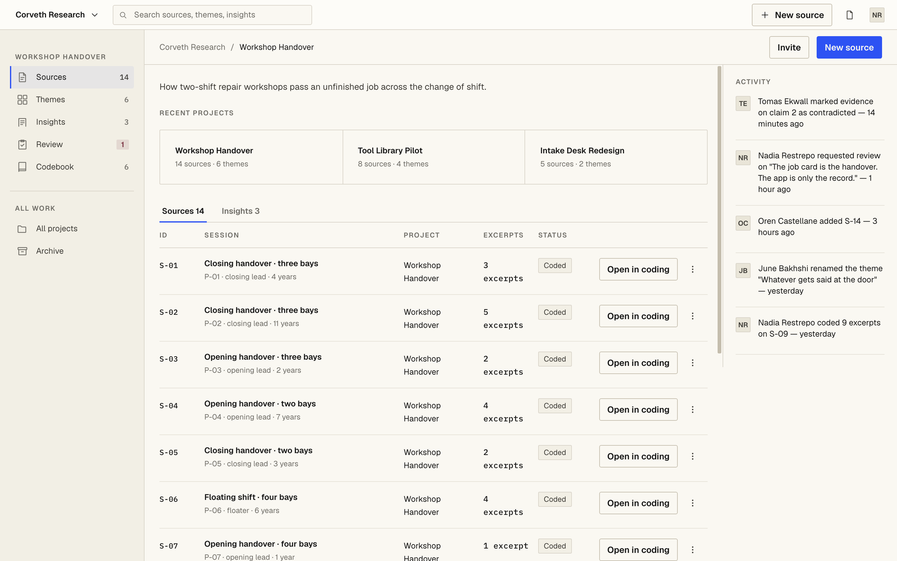
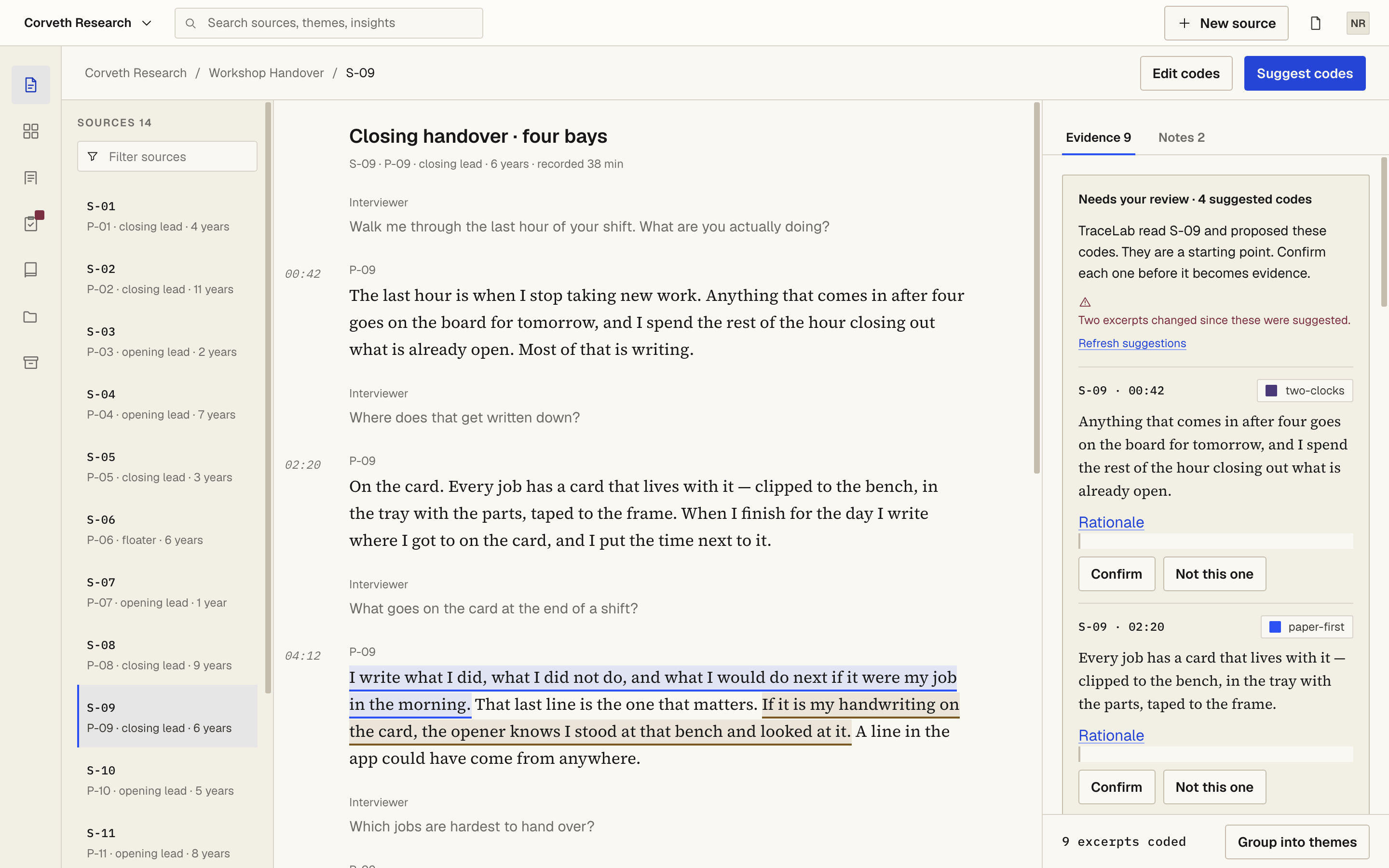
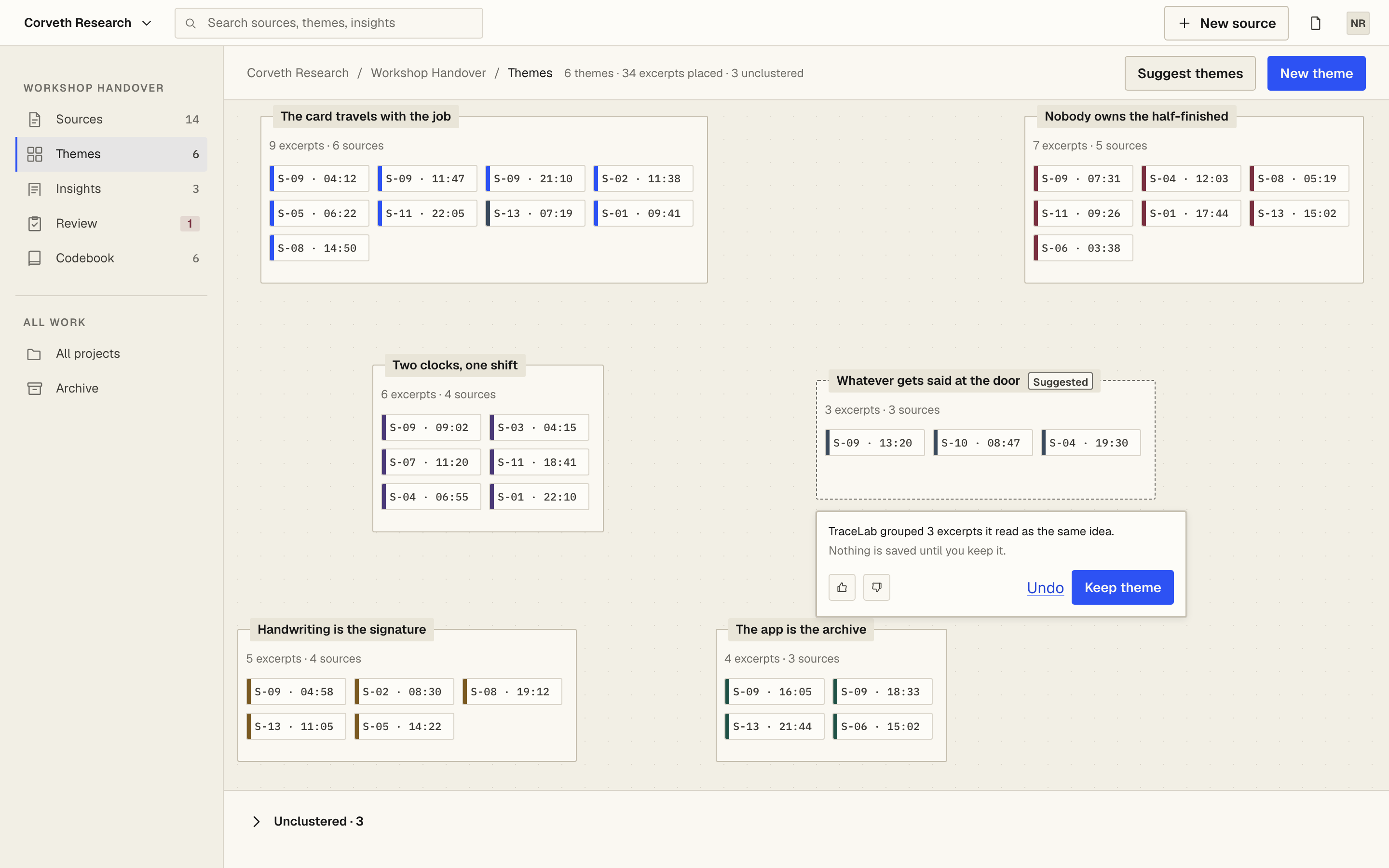
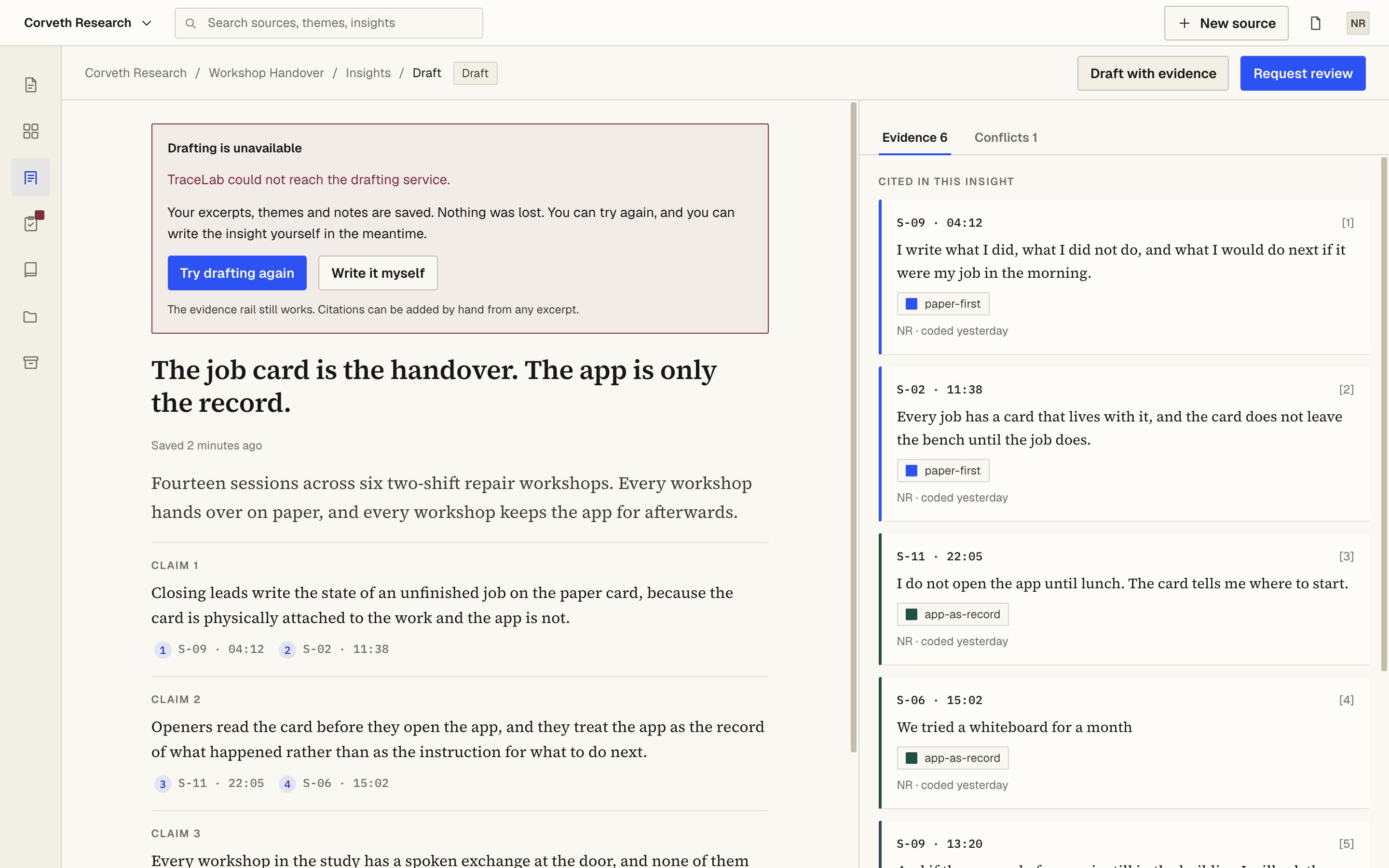
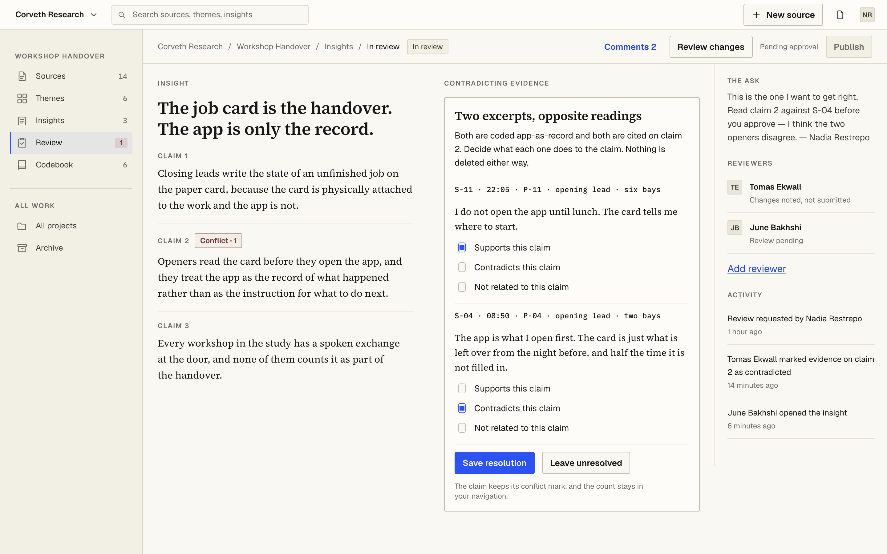
Public states are the ones a researcher reaches by using the
product. QA-only states — skeletons, a 240-turn session, a cluster
holding 24 chips, a validation reset, the print stylesheet — live in
Storybook and the test suite and never appear in the shipped bundle.
State inventory, counted from the screen × state matrix
| View |
● public |
○ QA-only |
total |
| 1 · Project Library | 5 | 2 | 7 |
|---|
| 2 · Transcript Coding | 11 | 3 | 14 |
|---|
| 3 · Theme Canvas | 5 | 4 | 9 |
|---|
| 4 · Insight Composer | 6 | 3 | 9 |
|---|
| 5 · Review | 8 | 2 | 10 |
|---|
| 6 · Published Insight | 5 | 2 | 7 |
|---|
| 56 states inventoried | 40 | 16 | 56 |
|---|
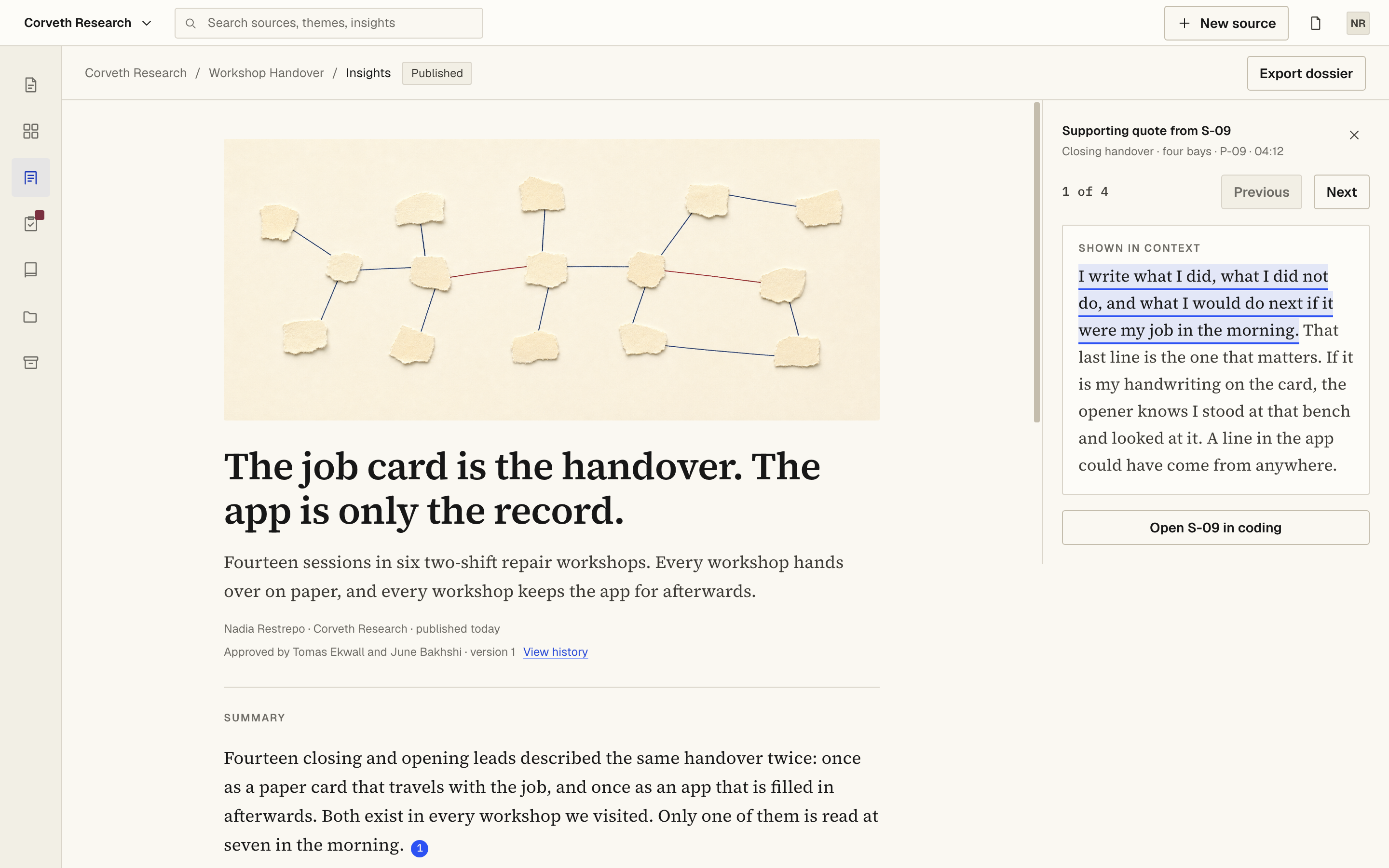
Eight of the 40 public states belong to the three edge states, because the
edges are part of the research experience and are held to the same finish
as the happy path. A permanent audit harness drives all 40 through product
controls, photographs each one and runs six DOM detectors over it, at
1440 × 900 with six states repeated at 1280 × 800 and twelve at
768 × 1024: 58 renders, 40 / 40 reached, 0
unreachable.
- overlap
- 0
- overflow & clipping
- 0
- truncation
- 0
- touch target
- 0
- contrast
- 0
- dead space
- 9
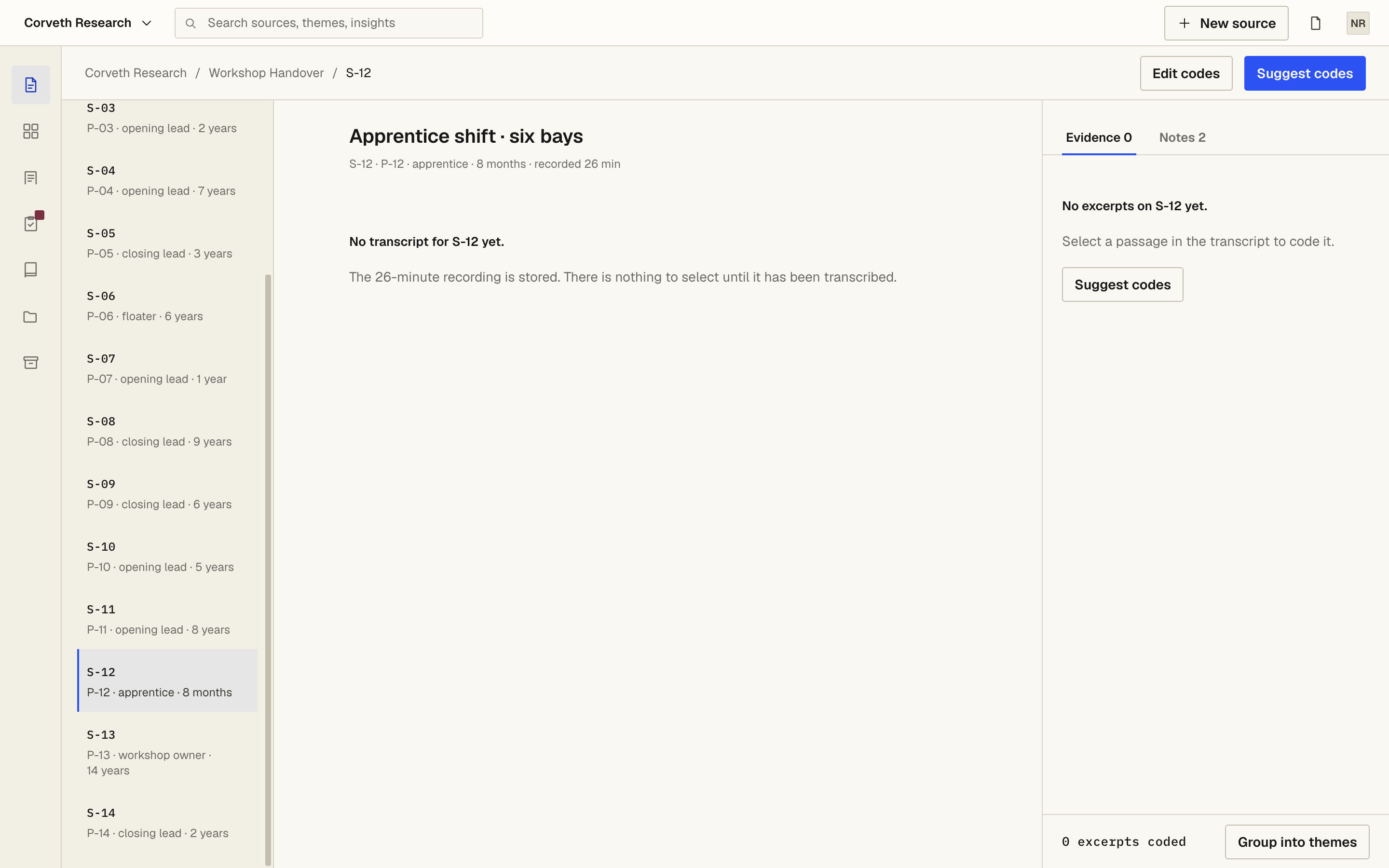
The nine dead-space findings are held rather than hidden, each with its own
measurement: four are empty or short data (a no-results search, a
three-row tab, and S-12 twice), four are geometry the screen spec fixes —
the 768 drawer is a drawer, not a column — and one is a three-claim
document shorter than its window, 15 px over the limit. Not one is closable
by composition, and every one of them is closable by fabrication. No
threshold was moved and no selector was added to an exclusion list to reach
the other five zeros.
The suites, and what each one is for
| Playwright | 99 passed — 33 tests × 3 viewports: critical flow 3, edge states 9, public guardrails 11, axe 9, QA print state 1 |
|---|
| Storybook | 30 / 30 passed across 6 suites, every play() executed; the a11y addon runs at test: 'error' and caught four defects the app-level scan had not |
|---|
| Guardrails | src/** and dist/** are read from disk and searched for a states menu, help overlay, reduced-motion toggle, debug panel, inspector, flow-step list, QA toolbar, all 56 state IDs, this page's disclosure sentence, and the strings .stories., storybook, @playwright — 0 hits in both trees |
|---|
| Audit | 58 renders, six detectors each, plus 10 contact sheets; the run reports what it finds rather than asserting the build is clean |
|---|
Accessibility, measured rather than asserted
axe-core ran over the six views and the three edge states at all three
viewports — 27 scans — with the WCAG 2.0 / 2.1 / 2.2 A and AA tag
sets, scoped to the product surface, with no disableRules()
and no waiver list anywhere in the spec. Result: 0 violations of any
impact, not merely zero serious and critical.
The scan waits for fonts painted, images decoded and the 160 ms route fade
landed before it runs. That is a correctness fix rather than a relaxation:
axe computes contrast from composited colour, and a scan taken mid-fade
reported a serious color-contrast on a frame nobody sees.
Contrast, read off composited pixels
The audit measures contrast on the pixels as painted — 280 runs,
0 indeterminate — which is how it caught the one finding a DOM walk
cannot. text-muted clears AA on paper at 5.02:1, but the
product tints the current navigation item and the open source row with 6 %
blue, and tints the failure card with 6 % oxblood. Composited, the same
colour reads 4.2:1 and 4.49:1.
The same ink, measured on three grounds. Ratios as reported by the audit run.
| Ink on ground | Measured | Against 4.5:1 |
|---|
text-muted on paper | 5.02:1 | passes |
|---|
text-muted composited over a current nav item's 6 % blue tint | 4.2:1 | fails |
|---|
text-muted composited over the failure card's 6 % oxblood tint | 4.49:1 | fails |
|---|
Those three runs, moved one rung down the ink scale to text-secondary | — | passes |
|---|
The palette did not change. Three runs took a darker ink; blue, oxblood and
paper kept every tint, chip, border and accent role they already held. A
brand colour that fails in one composite is not a brand problem, it is a
composite problem.
Keyboard operation, and what is not claimed
Radix carries the dialog, popover, dropdown, tabs and radio-group semantics
— focus trapping, Escape, roving focus — and four keyboard and
AT defects were found and repaired rather than waived: a
role="button" on an <article> that wrapped
its own focusable chips; a control nested inside a control on the focused
evidence card; a Radix modal dropdown that made the whole app
aria-hidden with focusable content inside it, fixed with
modal={false} rather than by hiding the rule; and two scroll
regions — the transcript and the cited-evidence list — that a keyboard user
could not scroll at all, because every coded span is a
<mark> and nothing inside them was focusable. The
reconciliation radios were given real 24 / 44 px targets while keeping the
16 px painted mark.
What is not claimed: this suite has no keyboard-only walk of the
critical flow. Every state the audit reaches, it reaches through a control
resolved by role and accessible name, which is a strong signal and not the
same proof. It is recorded here as an absence rather than dressed up as a
presence.
 1
2
3
1
2
3
 1
2
3
4
1
2
3
4
 1
2
3
4
1
2
3
4
 1
2
3
4
1
2
3
4
 1
2
3
4
5
1
2
3
4
5
 1
2
3
4
5
1
2
3
4
5
 1
2
3
1
2
3