Two books, one course, and a remaining count that disagrees with itself
A beauty clinic sells a course: six sessions of one treatment, paid once, delivered over months. That sale is written in the counselling ledger. The sessions themselves happen in a treatment room, and they are written in the room's own schedule. Two books, two clocks, two people keeping them — and the number that matters to the patient standing at the counter, how many are left, is a subtraction across both of them that nobody actually performs until somebody asks.
Sessura is a fictional operator workspace built on one refusal: what was sold and what was delivered are the same document. The day's board is a list of today's slots; a slot opens the course document behind it; and today's session is recorded there, against the remaining count, in one place where both numbers are already visible.
Every clinic, patient, course, treatment and figure in this project is invented. 真澄野クリニック does not exist, 葉山 千尋 is not a person, and no medical claim, efficacy statement, price, review or before-and-after photograph appears anywhere in the product or on this page. The prototype sends nothing: no booking, no chart commit, no payment, no request off origin.
Four things it refuses to be
Each of these was decided in the product's written truth before a screen was drawn, and each is a shape the interface had to be built into rather than a feature declined at the end.
- Not a KPI dashboardThe figures at the top of the board are a single dense row of counts with their qualifiers — 2 waiting, 6 sessions today, 17 open courses, 4 course kinds — not four large tiles with trends. There is no percentage, no delta, no sparkline and no chart in any state.
- Not a calendarThe day is a ledger read down a time column, not a grid of blocks in a week. The product's question is what is happening in this room today and what does it change, and a week grid answers a different one.
- Not a chart of progressThe course meter is six discrete pills carrying three named states — delivered, today's slot, remaining — with a legend beside them. It is a count you can point at, not a bar you have to estimate against.
- Not an inference engineThe product never derives the remaining count from anything it did not record. A permission-scoped total is stated with its visible subset beside it, so a number the operator cannot fully see is never quietly presented as a number they can.
The accounting truth the copy has to carry
Recording a session changes what was delivered. It does not change what was sold. Those are different columns in a real clinic's books and confusing them is the failure this product exists to prevent — so the interface says so in words, in the confirmation, before the operator commits: 実施済 moves and 販売 does not.
Six slots, and one of them is not yours to read
The board is one continuous ledger anchored on a time column at the left edge: six slots between 10:00 and 17:00, each carrying the treatment, the patient, the room, the attending staff and a state chip, on a single rule. The rhythm of the day is the point, so the rows are not broken into cards.
The 13:00 row belongs to another operator. It is not removed and it is not filled with a placeholder: it stays in the time sequence, dimmed, with its content replaced by 担当外のため詳細非表示, a hidden-eye icon and a 担当外 chip. The day still reads as a day. The permission boundary is drawn as a designed state rather than a gap.
2 カウンセリング待ち — 担当分 1
6 本日の施術 — 担当分 5
Product copy · KPI band, scoped counts with their visible subsetThat second line under each figure is a contract, not a decoration. When a count is taken over a surface the operator can only partly see, the product is required to state the visible subset beside the total; the run's domain truth records each scoped total with a companion fact for the part in scope. It is what stops 6 from quietly meaning six you can open.
The inspector is the same object in two places
On the desktop the selected slot's course summary sits in a right-hand column, permanently. At 768 and 390 the same summary expands inline directly beneath the selected row rather than moving to the bottom of the page or into a sheet. The reflow keeps the row and its consequence adjacent, which is the thing worth preserving; it is a re-composition, not a scaled-down desktop.
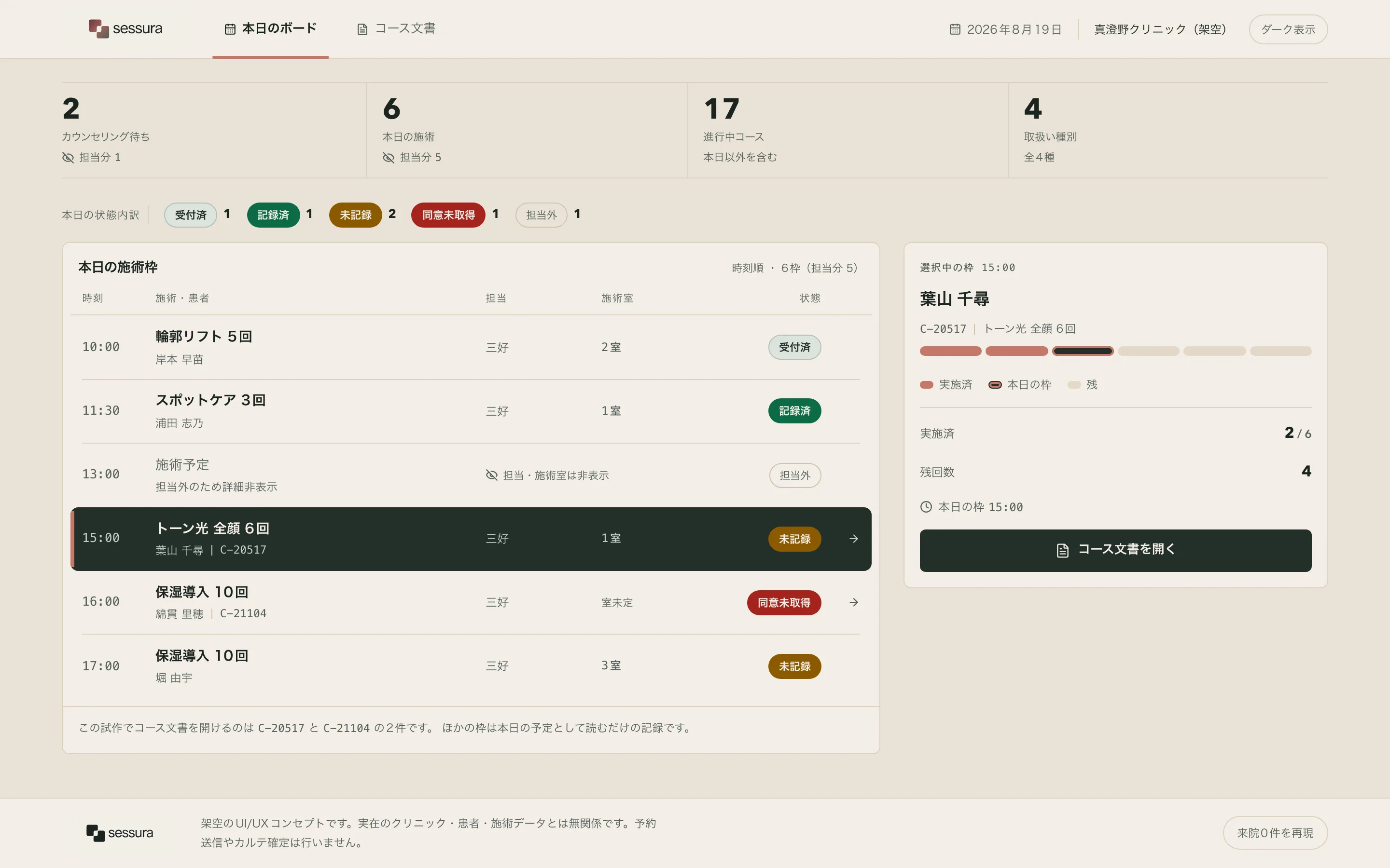
- Time columnSix slots on one rule, left-anchored on the clock. The day's rhythm survives because the rows are not cut into cards.
- State chipsFive states in the product's own vocabulary — accepted, recorded, unrecorded, out of scope, consent not obtained — each on its own declared semantic colour.
- The 13:00 rowMasked, not missing. Dimmed content, a hidden-eye icon and 担当外, so the sequence still reads and the boundary is legible.
- Scoped countsEach figure that can only be partly seen carries its visible subset beneath it.
- InspectorThe selected course, summarised: identity, meter, delivered, remaining, today's slot, and the one way into the document.
- Room columnA slot with no room assigned reads 室未定 rather than a bare dash — a correction made after a review found the dash unreadable.
Captured from the running build at device scale 2 through the run's own declared entry actions. The plate's ground and this page's ground are one step apart on purpose, so the screen has an edge without needing a device frame drawn around it.
The design system was opened by a person before a screen existed
The other six works in this notebook were authored, built and then reviewed. This one has a person inside the chain rather than at the end of it: the design system was authored first, published into a self-hosted Penpot as five boards, opened and edited by hand, and only the reviewed result was handed to the build as canon.
The five boards are Colours, Typography, Spacing & Radius, Icons and Components. The components board is not a mood board — it is the authored component spec rendered as real Penpot components: 8 components in 21 variants, every fill, radius, weight, gap and padding bound to a named token rather than a hex value, with the atoms built before the molecules that instance them. The icons board carries 10 icons from [email protected] under the ISC licence, each verified by digest before it was drawn.
The review is a difference, not an opinion
What makes the step real is that it is evidenced rather than asserted. The published state was hashed at d531b8da…; after the review the same file was read back and hashed at fbdff66d…; the path-level delta between them — 5 structural changes in this run — is the record of what the person actually did. An unedited approval is equally valid evidence: identical hashes mean approved without edits, and no score, rating or approval click exists anywhere in the step.
Three decisions a person made that the build had to obey
An earlier review of the same design system produced 32 edits, and those were distilled into written decisions before this run began. They are not style preferences; each one is a claim about what belongs with what.
The meter belongs to the patient
Name, course ID and the usage meter are one identity block. The delivered and remaining figures, and the action, sit outside it. The meter is an attribute of this person's course, not another number in the arithmetic row.
course rail · identity grouping
State blocks breathe
Vertical rhythm inside the rail moved from the small step to the medium one, and the success banner's heading-to-detail gap from the extra-small step to the small one. Blocks that carry a state are given room rather than compressed.
spacing · space.sm → space.md
Back is a control, not a decoration
The return affordance takes the same anatomy as every chip and button: the surface itself is the flex container and the label is its child. No background rectangle with a sibling text node.
component anatomy · back control
And the contract moved to match
The first decision could not be expressed under the spec's one-level nesting rule, so the rule was changed to permit two — the publisher had always supported it, only the validation refused. The person's decision changed the contract, not the other way round.
component spec · nesting depth
What the builder was actually given
The reviewed boards are exported and staged into the build kit alongside the visual direction and the golden screens, and the builder has to prove it read them: the run records the expected digest of every canon image and the digest of every image the model actually opened, and the two sets must match. For this build they do, across 8 canon artefacts — the two golden screens, the visual direction, and all five reviewed Penpot boards.
- Reference screens acquired locally through the Mobbin MCP, each bound by SHA-256 in the pack manifest
- 46
- Selected after opening every one of them, and cited by the role plan
- 10
- Named regions promised before the build and checked after it, across the desktop and mobile surfaces
- 5 × 2
- Canon images the builder proved it read, by digest
- 8 / 8
- Brand identity, copy or screen composition copied from any reference
- 0
The five regions bound by that plan are the day ledger, the course rail, the course meter, the state signals and the empty day — the same five in both the desktop and the mobile surface. Binding them is a promise made in writing before the build about which reference answered which composition question, so that afterwards the claim can be checked instead of believed. Two further regions were dropped from the plan when their intended references did not survive re-acquisition, and were built from first principles instead; that is recorded in the run rather than papered over.
The meter belongs to the patient, not to the arithmetic
Opening the 15:00 slot opens the course document behind it: C-20517, トーン光 全顔 6回, sold as six, two delivered, four remaining, with today's slot at 15:00. The page is the sold plan and the delivery history on one surface, under a single heading — 販売の計画と、実施の履歴.
The layout follows the review decision exactly. The patient's name, the course identifier and the six-pill meter are one block. The delivered and remaining figures are a second block. The action is a third. Before the review the meter sat with the figures, where it read as one more statistic; grouped with the identity it reads as this is where this person is in this course, which is what an operator is actually looking for when a patient is standing in front of them.
The pills carry three states in the product's own colours — delivered in clay, today's slot in the dark selected surface, remaining on the track tone — and a legend names all three beneath them. The same three-part vocabulary appears in the board's inspector and again in the document, so the reading does not have to be relearned between surfaces. A generic progress bar would have been shorter and would have thrown away the distinction between done and today.
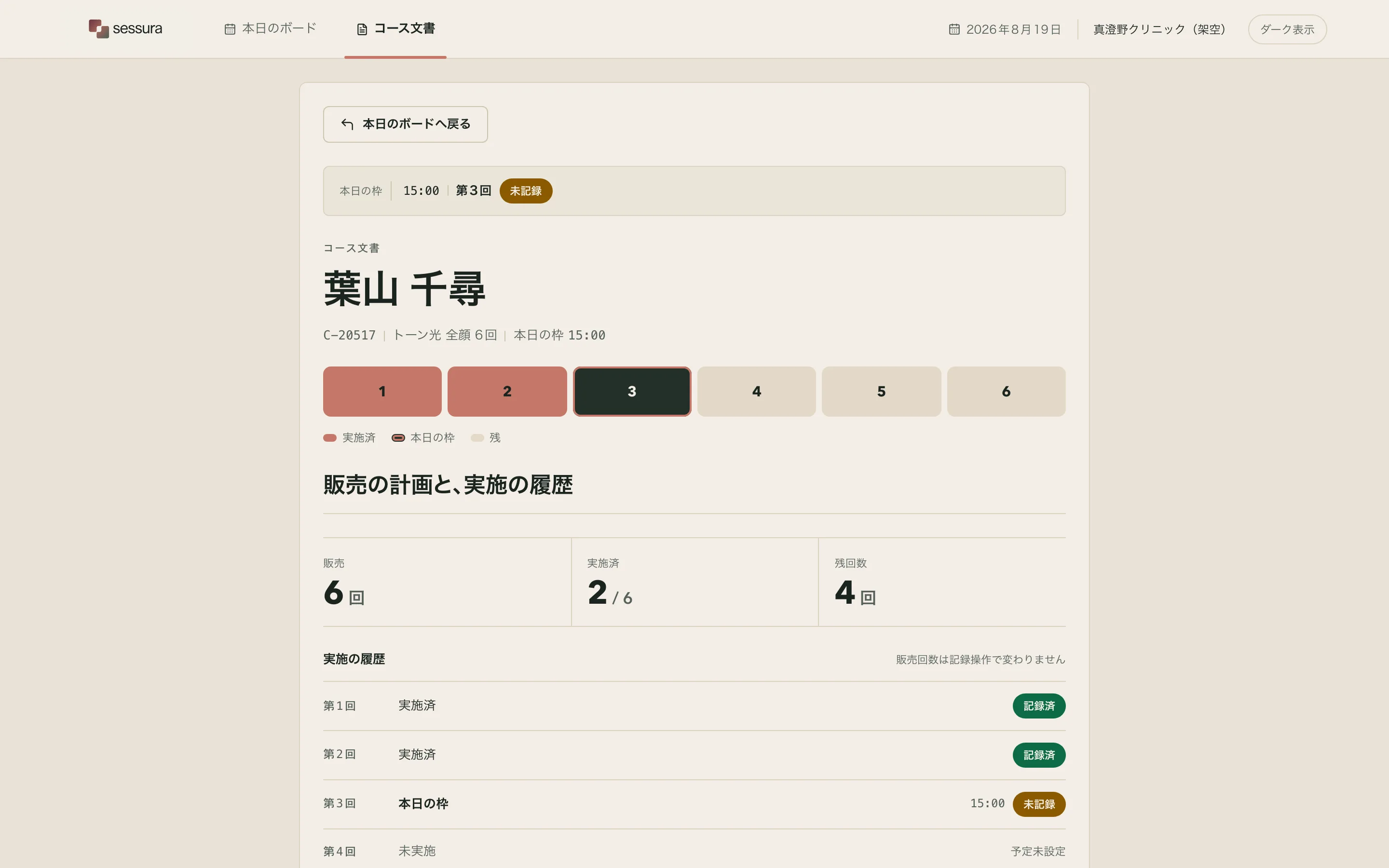
- Identity blockName, course ID and meter grouped together — the decision a person made in Penpot, carried into the build.
- Six pillsThree named states with a legend, not an estimated bar. The same vocabulary as the board's inspector.
- 販売 / 実施済 / 残回数The sold figure sits beside the delivered one permanently, so the two books are visibly one document.
- Delivery historyEach past session as its own line with its state chip, rather than a single aggregate number.
- One actionThe document has exactly one thing to do, and it is the thing the operator came here for.
- Back controlSurface-as-container anatomy, identical to every other control — the third review decision.
The subtraction is printed before it is made
The single action on the document does not open a confirmation dialog asking are you sure. It states the arithmetic it is about to perform, in a sentence, in plain Japanese, before it is performed:
記録すると、実施済が 2 から 3 に、残回数が 4 から 3 になります。
販売 6 回は変わりません。
Product copy · record confirmation, stated before the actionThat last line is the whole product in one sentence. A course sold as six stays sold as six; only the delivered count moves. An operator who has been reconciling two books by hand knows exactly how easy it is to decrement the wrong column, and the interface takes that responsibility rather than leaving it to training.
After recording, the state resolves in two places at once: the success banner states the new figures, and the row that produced it changes its chip to 記録済. The product does not rely on a toast that will be gone in four seconds — the ledger itself is updated in front of you, which is the only evidence that survives looking away.
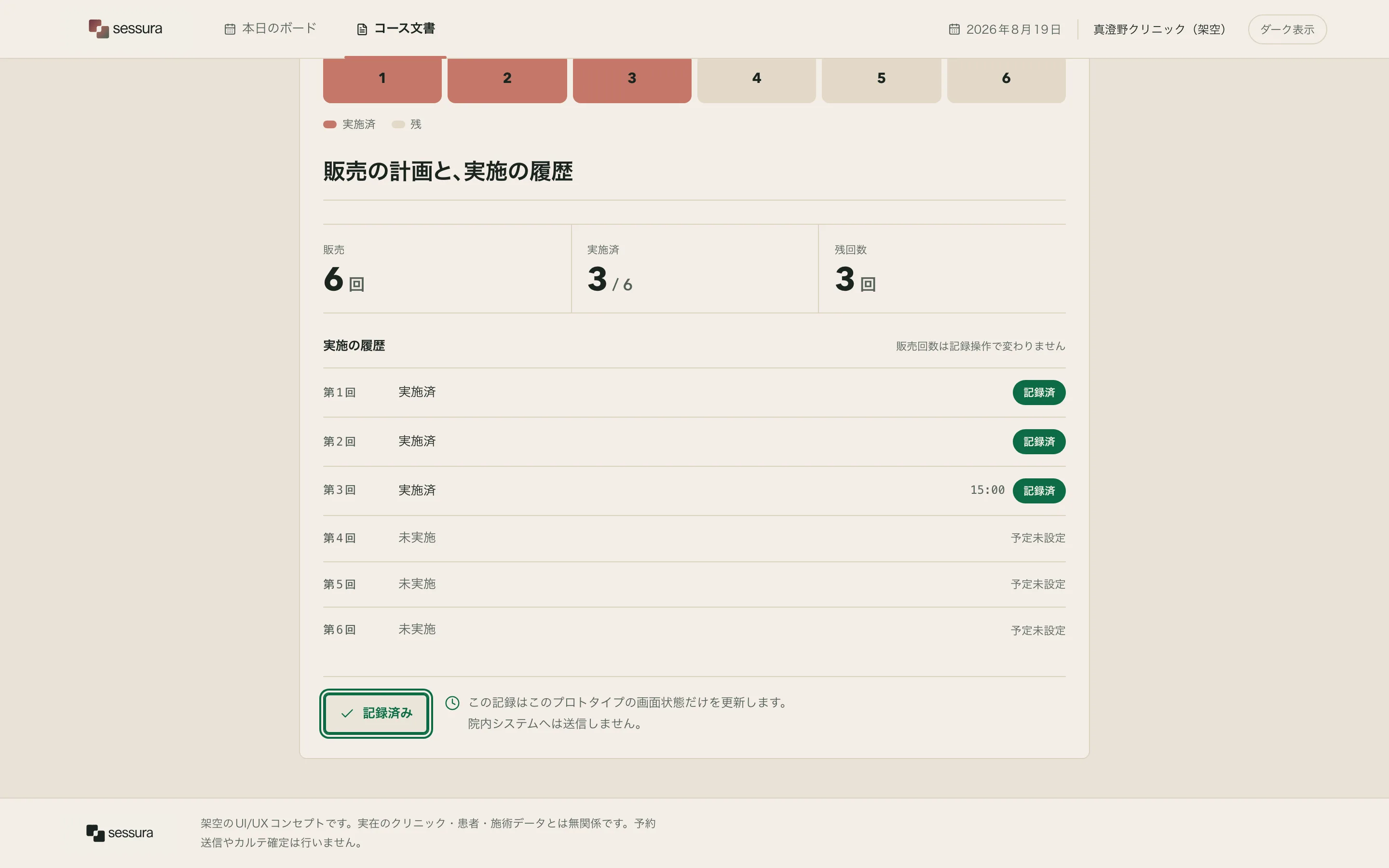
- Success bannerGreen on the declared success token, carrying the new figures as facts rather than a congratulation.
- MeterThree pills filled. The change is legible without reading a number.
- 販売 6 回Unchanged, and visibly so. The sale did not move because a session was delivered.
- HistoryToday's session takes its place in the list rather than only incrementing a total.
- ActionDisabled once the day's session is recorded — though it keeps its imperative label, which the final review named and this page does not hide.
- BoardThe originating row's chip changes to 記録済 in the same transition, so the two surfaces never disagree.
A course that cannot be recorded, says so twice, and then stops
The 16:00 slot carries a course whose consent form has not been obtained: C-21104, 保湿導入 10回. Its chip on the board is 同意未取得 on the declared blocked colour, and opening it produces a document where the record action exists but is withdrawn, with the reason stated above it rather than hidden behind the disabled control.
同意書が未取得のため、施術を記録できません
C-21104 ・ 保湿導入 10回
Product copy · blocked state, stated with its subjectStating the reason with its subject is the part that matters — a blocked action that says only not permitted forces the operator to reconstruct which record they are being stopped on. Here the identifier travels with the refusal.
And here the state stops short — named in the final review, not repaired
What the screen does not carry is a way out. It declares the block twice and then ends in a disabled button: there is no route to the consent form, no indication of who obtains it and no next actor. The reviewer called it a dead end, and it is one. Adding a recovery path means designing a flow that is not in this slice's catalogue, so it is recorded as a standing finding rather than patched into the corner of a screen.
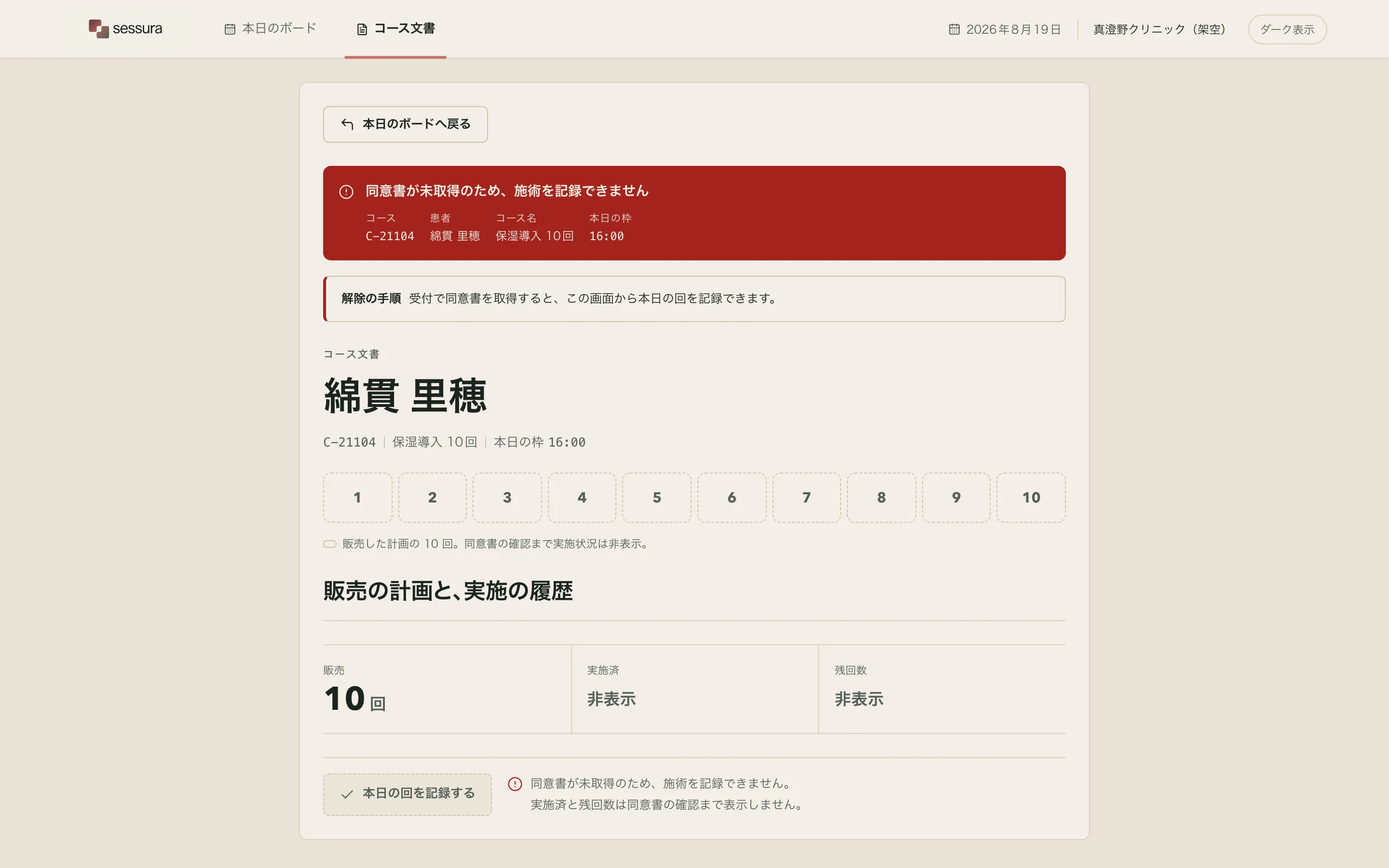
- Blocked bannerOn the declared blocked token, carrying the identifier of the course it refuses.
- Same documentThe blocked course is not a different screen — it is the course document with one capability withdrawn.
- Disabled actionPresent and visibly unavailable, so the operator learns the action exists and why it is out of reach.
- No recovery routeThe standing finding, stated above and not designed around.
A day with nobody in it, drawn in the wrong idiom
A clinic day with no visits is a settled fact, not a failure and not a loading state, and the copy treats it that way: 本日の来院はありません, with a line explaining that the board recomputes when the normal dataset is restored, and one control to do it.
The ornament above that sentence is three rounded bars. That is the loading-skeleton idiom almost exactly, and the final review said so plainly: a reader arriving at this screen reads content is still coming rather than there is nothing today. The ornament also came out of the Penpot review — it is one of the five edits the person made in this run's own review of the design system — which is the honest complication worth stating rather than smoothing over: a human review inside the chain is not a guarantee of the right answer. It is a guarantee that a person's judgement is recorded, carried into the build and legible afterwards, including when a later reviewer disagrees with it.
The second finding on this screen is the control's label. The empty card's button reads 本日のボードへ戻る while the board tab is already selected — it restores the normal dataset rather than navigating anywhere, so the words point at a screen the operator is already on. Both findings are named in the examination below and neither is repaired: the single visual repair this run was permitted had already been spent.
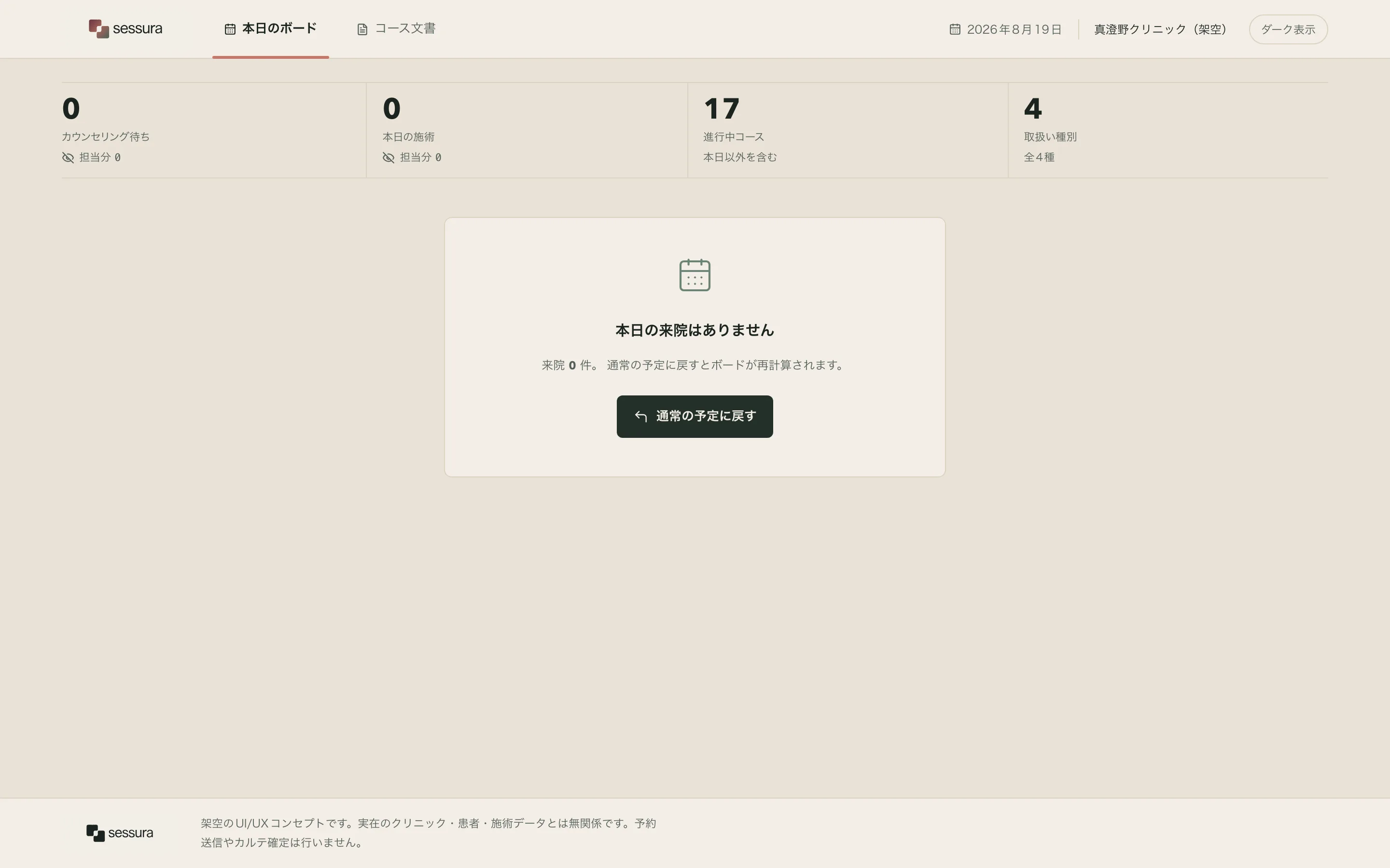
- The sentenceA fact, not an apology, and not an invitation to do something else.
- The ornamentThree rounded bars — the skeleton idiom. Named by the final review as reading like loading.
- The controlRestores the dataset, but is labelled as navigation to the current screen.
- The band aboveKept, so the operator can still see the day's counts are genuinely zero rather than hidden.
The same document at night, on the same tokens
The dark theme is not a second design. It is the same component tree with the ground and ink roles exchanged, and every semantic colour — success, warning, blocked, selected, the meter's track — resolved from the same named tokens the light theme resolves from. The pills keep their three-state vocabulary, the identity block keeps its grouping, and the figures keep their tabular alignment.
Two corrections landed here after earlier reviews and are visible in this plate. A persistent blue ring used to be painted around the whole document panel whenever the panel received focus programmatically after navigation; it read as a browser artefact rather than a design decision, and it is now restricted to keyboard focus on interactive controls. And a brand plaque used to be repeated inside the document card; the lockup is now confined to the application shell, where a brand mark belongs.
One coverage gap, stated
In this run the board was captured in light and the document in dark, but not the reverse. That means the token system is demonstrated across both themes and both screens, but not proven for every screen in every theme. The final review named the gap and it stands.
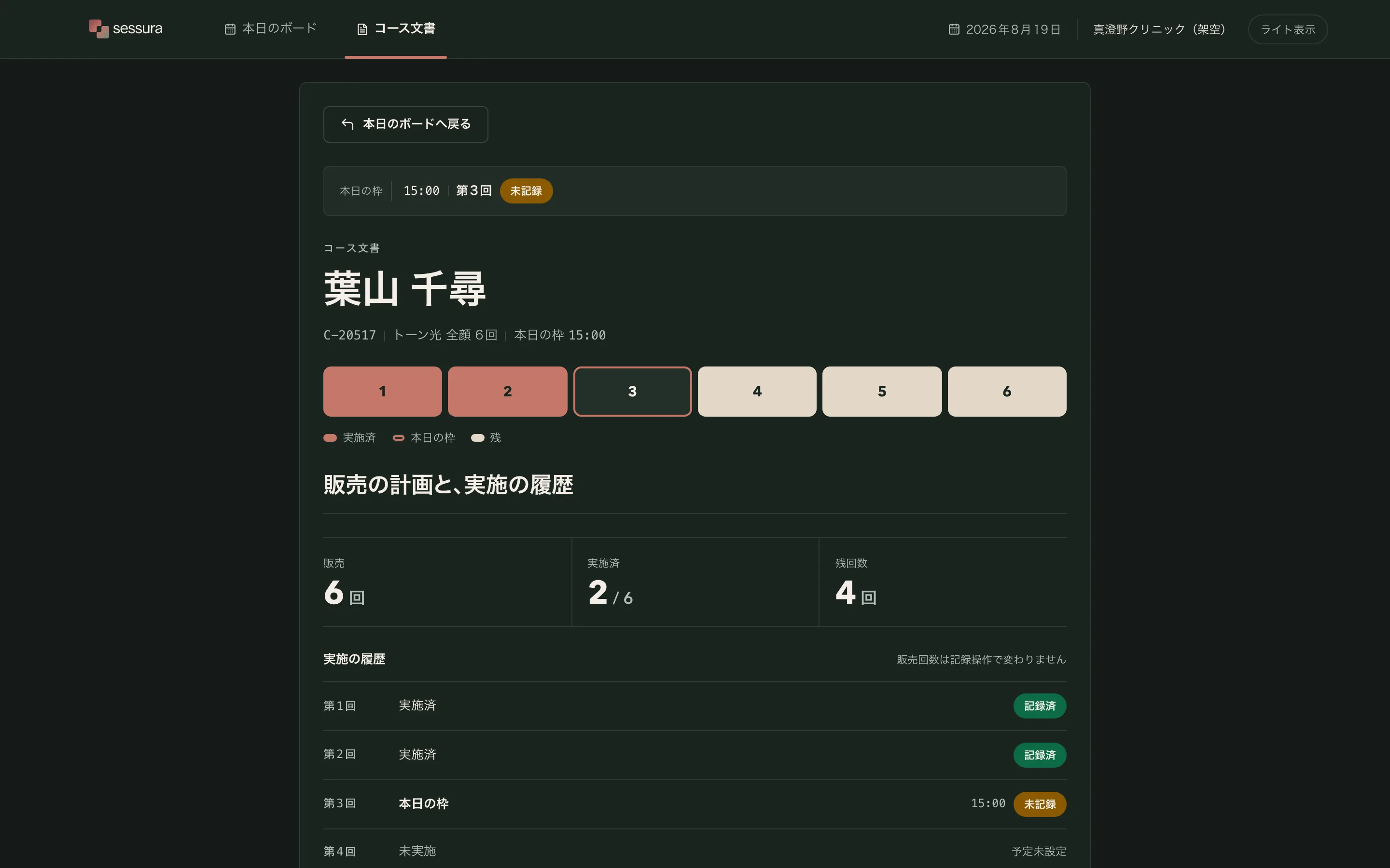
- Ground and ink exchangedNot a second design — the same tree, the same tokens, two resolutions.
- Semantic colours holdSuccess, blocked, selected and the meter track all keep their meaning against the dark ground.
- No panel ringFocus restricted to keyboard focus on controls, after a review found the persistent ring read as a browser default.
- No plaque in the cardThe lockup is confined to the application shell.
What was walked, and what was only photographed
Every figure below was read out of a receipt in the run rather than recalled. The audit enters each public state through the state graph's own declared actions, asserts the state's expected selectors are present and visible, verifies the theme against a written contract, and only then photographs it.
| Reading | Count | Result |
|---|---|---|
| Captures across 5 public states, 3 viewports and 2 themes | 28 | complete |
| Declared-control checks — 14 primary, 16 persistent, 21 content regions | 51 | 0 failed |
| Geometry — overlap, clipping, truncation, tap area, spacing | — | pass |
| Accessibility checks | 8 | 0 failed |
| Canon images the builder proved it read, by digest | 8 | 8 / 8 |
| Objective repairs permitted, and spent | 1 | 1 |
| Visual repairs permitted, and spent | 1 | 1 |
The capture harness photographed the settled screen, and called it an interaction
Of those 30 captures, eight are labelled interaction. For most of this run they were byte-identical to their viewport counterparts, and the reason was not that the product has no hover or press treatment — the harness took the interaction capture with exactly the same steps as the resting one. It never hovered anything and never focused anything, so three consecutive reviews reported the absence of interaction evidence and no build could have answered them. That was fixed in the lane rather than explained away here: the capture now hovers and keyboard-focuses a control the state graph declares for that state, and seven of the eight interaction captures on this build differ from their resting twins. The remaining three findings above are what is left of the same defect — the picker still reaches the header navigation on some screens instead of the screen's own control.
Three consecutive reviews reported the same absence, and no amount of building could have answered it: the finding belongs to the instrument, not to the product. It is stated here because a case study that quietly dropped the two findings it found inconvenient would be worth less than one that names them. Interaction feedback in this work is unevidenced.
Five findings left standing, and who owns each
The final visual review read all 30 captures and returned REPAIR_ONCE with the single permitted visual repair already spent earlier in the same cycle. Under this lane's own rule that verdict is not a pass, and the work is published with the verdict stated rather than with the verdict omitted. Here is everything it found.
- The meter legend and the number disagree about 「残」Before recording, three pale segments are labelled 残 while the figure beside them reads 残回数 4 — today's unrecorded slot is drawn as its own colour but counted into the remainder. After recording the two agree, so the conflict is confined to the pre-commit view. The reviewer found it twice, in two batches, and it is the one finding here that is about the product rather than about the evidence. Owned by the design.
- The board's interaction capture never traverses the boardThe capture puts a focus ring on the header navigation tab rather than on the ledger row that is the screen's own operating surface. Owned by the capture harness, not the build.
- One interaction capture is a duplicatesession.recorded at 390 carries the same digest as its viewport twin, so that state has no interaction evidence at all. Owned by the capture harness.
- The blocked state's interaction capture misses its own controlSame cause: the global navigation is focused instead of the disabled commit control, which is precisely the affordance a reader would want to see refused. Owned by the capture harness.
Three of the five are the same harness defect seen from three angles, and it is being fixed in the lane rather than papered over here: the interaction capture now hovers and keyboard-focuses a control the state graph declares, and a later change ranks a screen's own controls above the chrome. What remains against the product itself is the 「残」 conflict, which is real, small, and stated.
The same review recorded six strengths, and two are worth repeating because they are the things the product was built to do: the primary task reads as one line without explanation — the day's slots, a selected row, the inspector, the document, the record — and the record action states its own arithmetic in advance, so the difference between what was sold and what was delivered is carried by the interface rather than by the operator's memory.
Sources, stack, and what was not taken
References were acquired rather than remembered: 46 shipped product screens pulled locally through the Mobbin MCP over 8 recorded tool calls, every one of them bound by SHA-256 in the run's own pack manifest. Ten were selected after opening all 46, and each selection carries a written note of what was actually seen in the image.
What was taken from them is composition and state treatment — how a time-anchored ledger holds its rhythm, how an identity card groups a person with their progress, how a completion reads in the same frame as the row that produced it. What was not taken: no brand identity, no copy, no product data, no logo and no whole-screen composition. The rights state on every reference in the pack is study-only, and none of the images is redistributed with this page.
Built out of
A static responsive application — HTML, CSS and a small amount of JavaScript for state transitions, with the whole fixture compiled in. The design system is the run's own authored token contract: five brand primitives from a confirmed logo run, six semantic roles declared rather than derived from the brand hues, a spacing scale, three radii, and five typographic roles. The type is the product's own — a geometric display face for the counts and headings so they echo the wordmark, a Japanese-first sans for prose, and a monospaced face reserved for course identifiers and clock times.
The 10 icons are lucide at [email protected] under the ISC licence, each recorded with its digest in the run's icon plan before use. The brand lockup is from the project's own confirmed logo run and is confined to the application shell.